Banners Slider
The Banners Slider component displays multiple promotional images or messages in a carousel format. It showcases products, offers, or announcements while enhancing your store's visual appeal and driving customer engagement.

Settings
Navigation Options
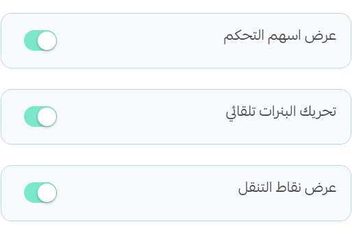
- Enable Navigation Arrows: Toggle to show/hide navigation arrows on the sides of the section
- Autoplay: When enabled, banners will automatically transition at set intervals
- Navigation Dots: Toggle to show/hide navigation indicator dots at the bottom of the section
Banner Settings
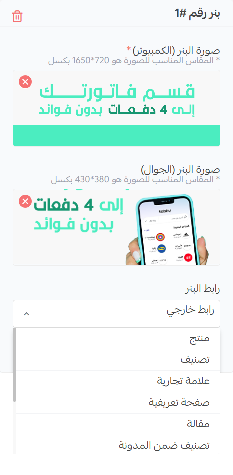
Image Banner
- Desktop Image: Upload an image optimized for desktop displays (recommended size: 1650×720px)
- Mobile Image: Upload an image optimized for mobile displays (recommended size: 430×380px)
- Banner URL: Enter the URL where users will be directed when they click on the banner