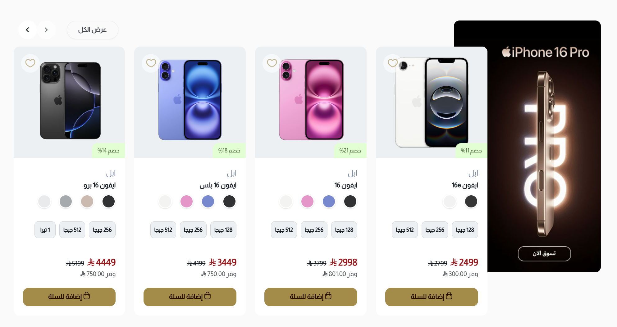
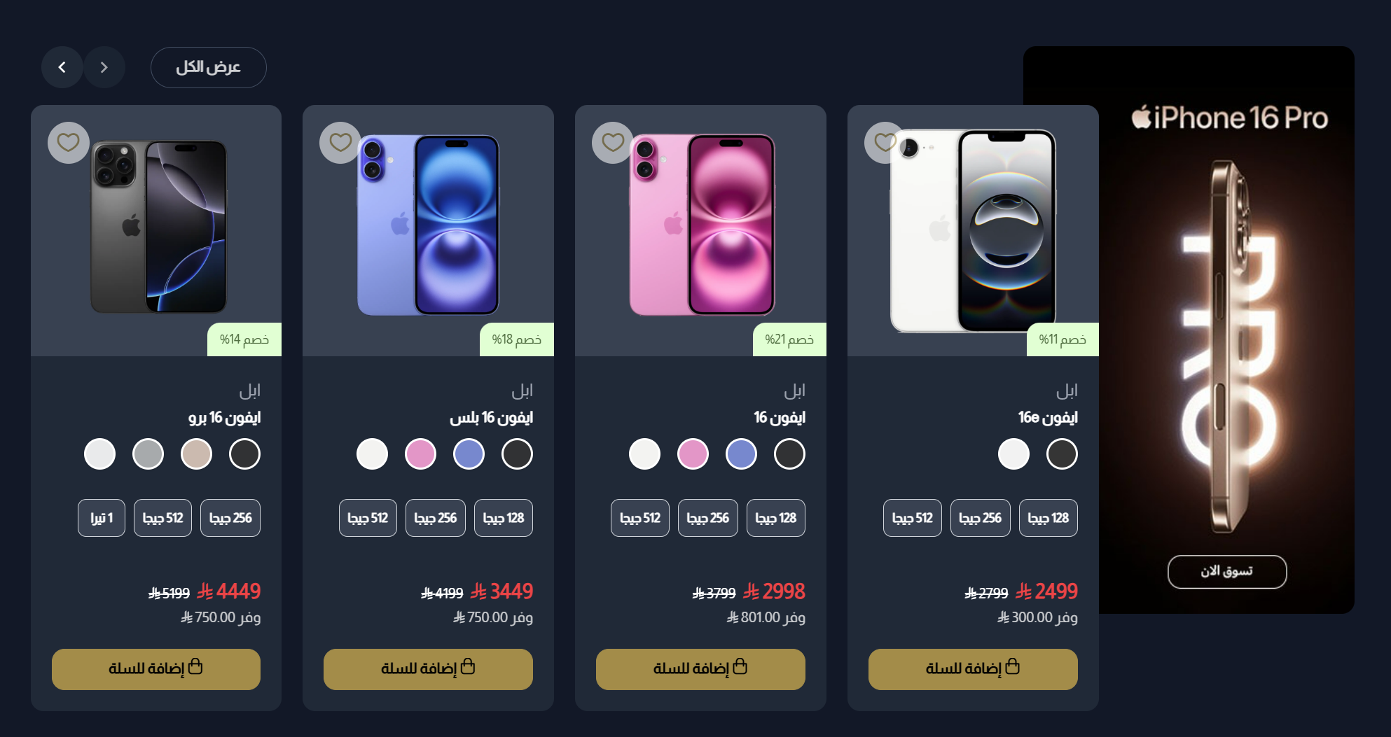
Product Slider with Banner
The Product Slider with Banner component displays your products in an attractive, scrollable carousel alongside a promotional banner. This versatile component is ideal for highlighting featured collections, showcasing new arrivals, or promoting special offers while efficiently utilizing screen space. The banner provides additional marketing opportunity to capture customer attention.
Settings
Title and Subtitle
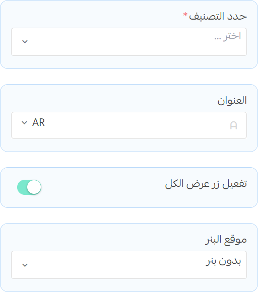
- Select Category: Choose the product category to display in the slider. You can select from existing categories.
- Title: Enter the main title for the section
- Show More Button: Toggle to display a "Show More" button that links to the category page
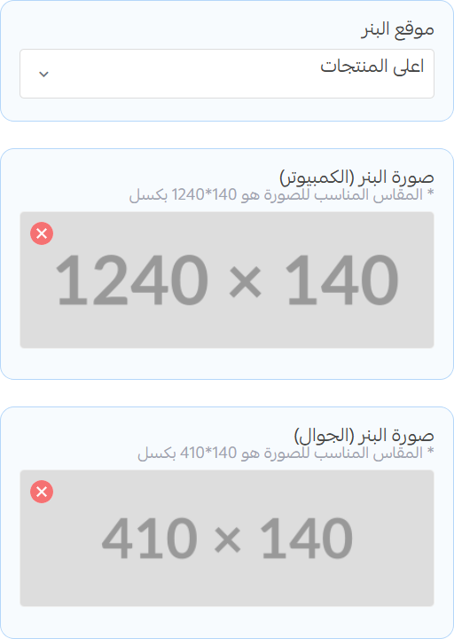
- Banner Placement: Choose the position of the banner relative to the slider (top, bottom or none)
Top Banner
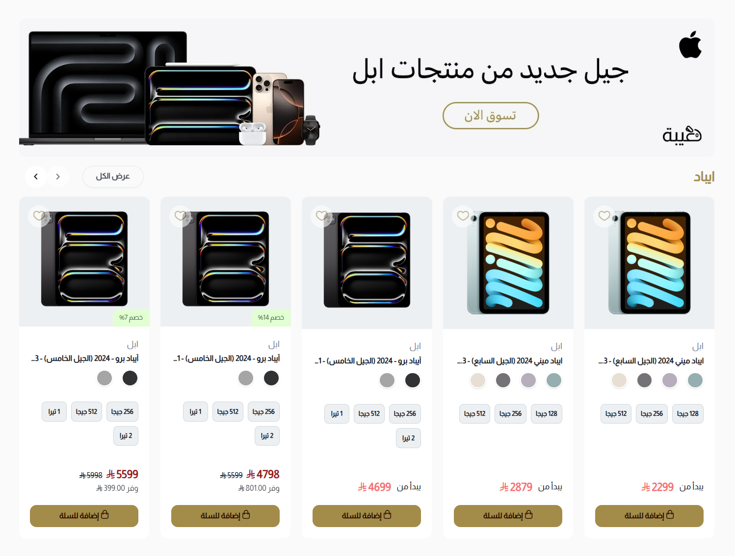
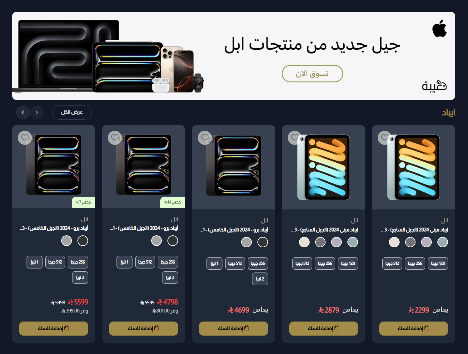
when you choose Top of Products placement, the banner will appear above the product slider.
- Desktop Image: Upload an image that will be displayed on desktop (recommended size: 1240x140)
- Mobile Image: Upload an image that will be displayed on mobile (recommended size: 410x140)
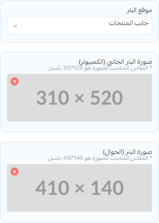
Side Banner
when you choose Side of Products placement, the banner will appear to the side of the product slider.
- Desktop Image: Upload an image that will be displayed on desktop (recommended size: 310x520)
- Mobile Image: Upload an image that will be displayed on mobile (recommended size: 410x140)