Divider
The Divider component allows you to showcase the Divider or manufacturers you work with, enhancing credibility and trust with your customers. This component is ideal for stores that feature multiple Divider or want to highlight partnerships.

Settings
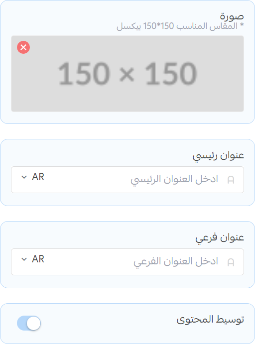
Title
- Image: Upload an image that visually represents the divider. (recommended size: 150x150)
- Title: Set the main title for the section.
- Subtitle: Add a subtitle to provide additional context.
- Center Content: Toggle to center the content within the section.
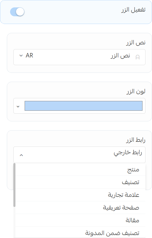
Button
- Enable Button: Toggle to enable or disable the button.
- Text: Set the text for the button.
- Color: Choose a color for the button.
- Url: Set the URL that the button will link to.
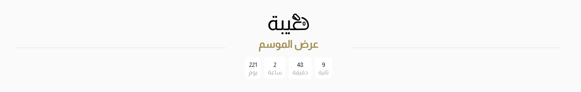
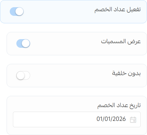
Countdown
- Enable Countdown: Toggle to enable or disable the countdown timer.
- Labels: show or hide the labels for the countdown timer (e.g., Days, Hours, Minutes, Seconds).
- Transparent Background: Toggle to remove the background from the countdown timer.
- Countdown Date: Set the date and time for the countdown to end.
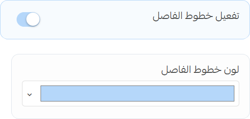
Lines
- Enable Divider Lines: Toggle to enable or disable the divider lines.
- Color: Choose a color for the divider lines.