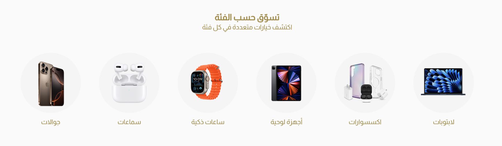
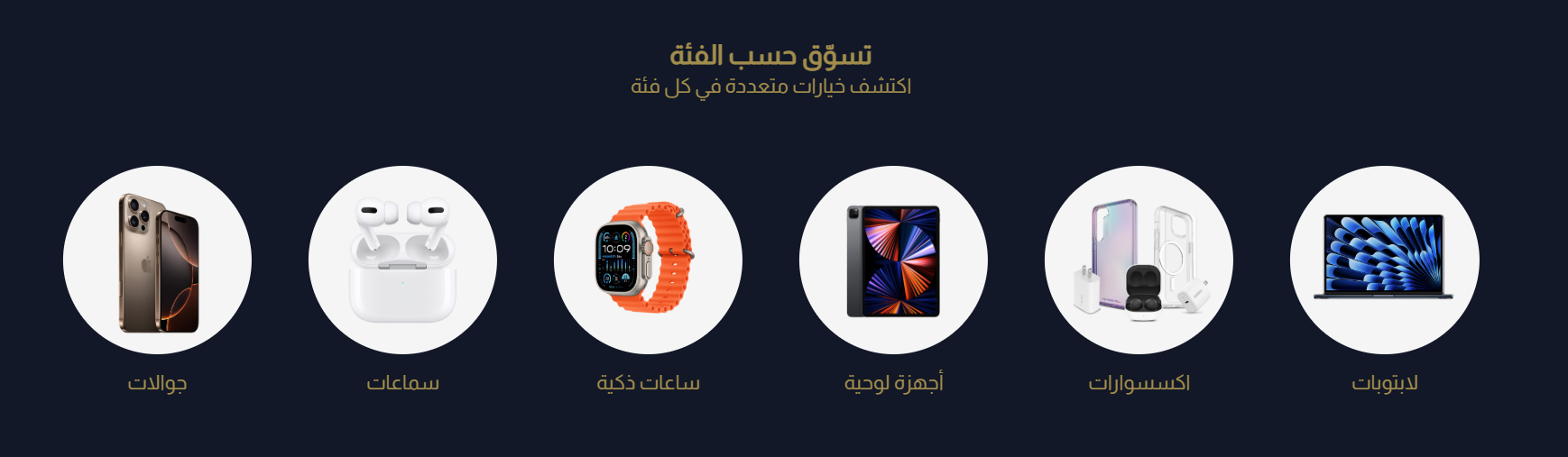
Shop By Category
The Shop By Category component organizes your store's product categories for easy navigation and discovery. It helps customers quickly find relevant product groups, enhancing the shopping experience for stores with diverse catalogs.
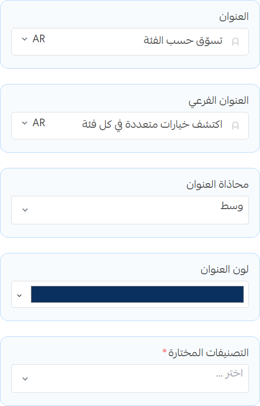
Settings
Title, Subtitle and Categories
- Title: Set the main heading for the section.
- Subtitle: Add a short description or tagline under the title.
- Content Alignment: Choose how to align the content within the section.
- Title Color: Set the color for the title text.
- Categories: Select which product categories to display in this section.
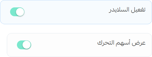
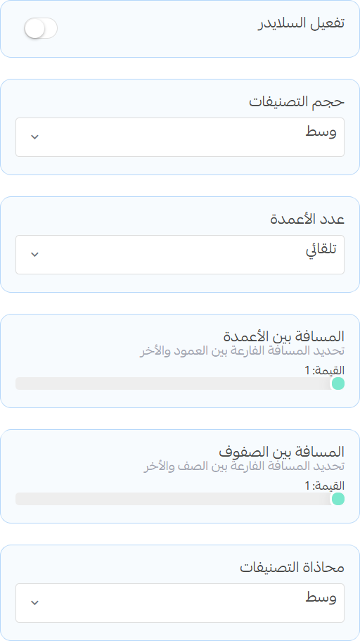
Category Display
info
When you enable the slider, the products will be displayed in a slider layout instead of a grid.
- Enable Navigation Arrows: Toggle to show/hide navigation arrows on the sides of the section
Grid Settings
- Category Size: Choose the size of the category cards.
- Columns Count: Set the number of columns for the section.
- Columns Gap: Adjust the spacing between columns.
- Rows Gap: Adjust the spacing between rows.
- Category Alignment: Choose how to align the categories within the section.
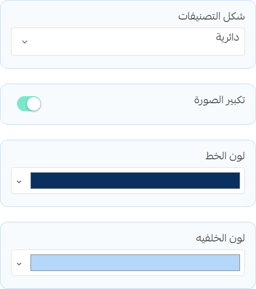
Category Design
- Category Shape: Select the shape of the category cards.
- Image zoom: Enable this option to zoom in on the category images when hovered over.
- Text Color: Set the color for the category text.
- Background Color: Set the background color for the category cards.
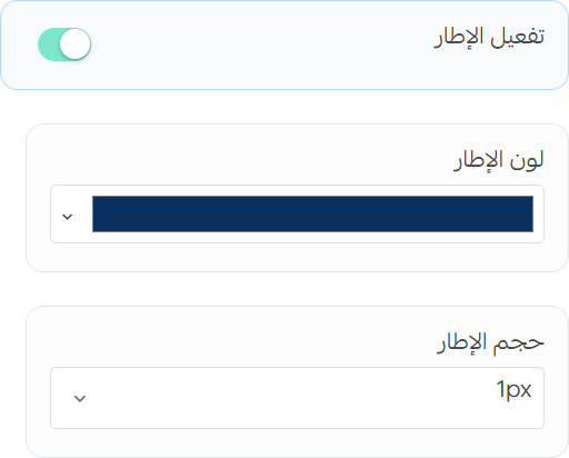
Borders
- Enable Borders: Toggle this option to add borders around the category images.
- Border Color: Set the border color for the category images.
- Border Width: Adjust the width of the border around the category images.
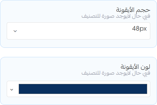
Icons
- Icon Size: Adjust the size of the category icons.
- Icon Color: Set the color for the category icons.
info
the icons are only shown if the category has no image set.