Square Photos
The Square Photos component displays images in an equal-sized square grid layout. Perfect for showcasing product collections, galleries, or feature highlights in a visually organized manner.
Settings
Title and Subtitle
- Title: Enter the main title for the section
- Subtitle: Enter a subtitle to provide additional context or information
- Content Center: Toggle to center the title and subtitle within the section
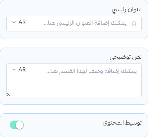
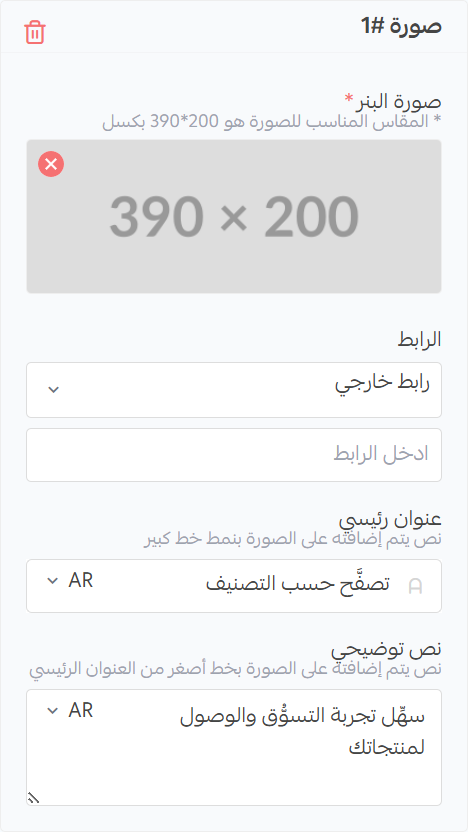
Image Banner
tip
The recommended image size for the first image is (390x430), since the first image spans two rows.
- Square Image: Upload images that will be displayed (recommended size: 390x200)
- Image URL: Enter the URL where users will be directed when they click on the Square Photos
- Image title: Enter the title that will be displayed when users hover over the Square Photos
- Image subtitle: Enter the subtitle that will be displayed when users hover over the Square Photos