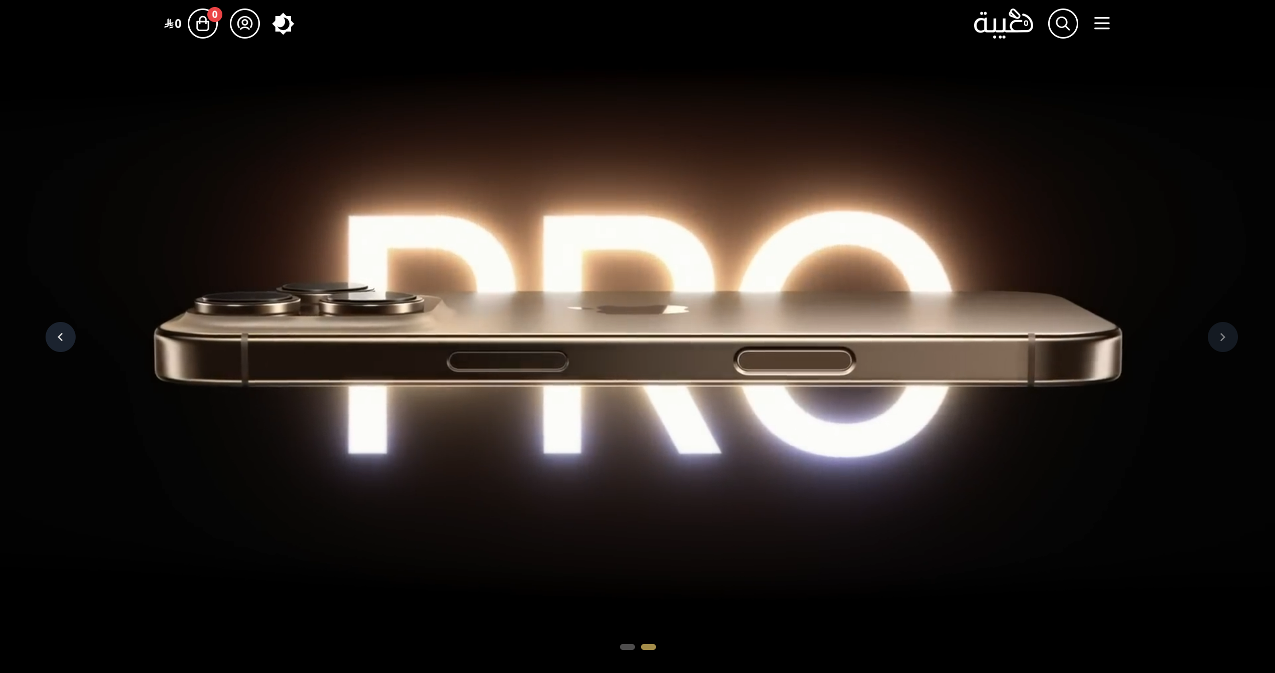
Hero
The Hero component is a prominent visual section in the Taibah theme designed to capture attention and showcase your store's main message, branding, and call-to-action. It typically appears at the top of your homepage or landing pages for maximum impact.

Settings
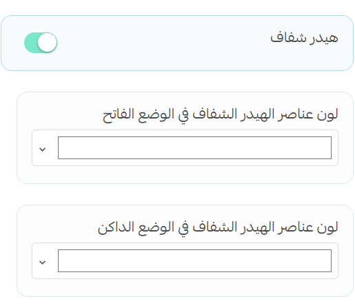
Transparent Header
When enabled, this setting makes your header transparent, allowing it to overlay the hero section.
- Light Mode Items Color: Select the color for navigation items when in light mode
- Dark Mode Items Color: Select the color for navigation items when in dark mode
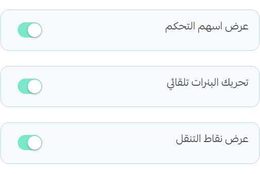
Navigation Options
- Enable Navigation Arrows: Toggle to show/hide navigation arrows on the sides of the hero
- Autoplay: When enabled, banners will automatically transition at set intervals
- Navigation Dots: Toggle to show/hide navigation indicator dots at the bottom of the hero
Banner Settings
Video Banner
Enable this option to display a video instead of an image in the hero section.
- Video URL: Enter the URL of the video you want to display
- Video Loop: When enabled, the video will play continuously in a loop
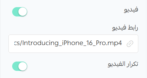
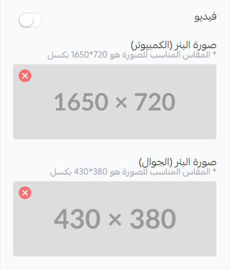
Image Banner
- Desktop Image: Upload an image optimized for desktop displays (recommended size: 1650×720px)
- Mobile Image: Upload an image optimized for mobile displays (recommended size: 430×380px)
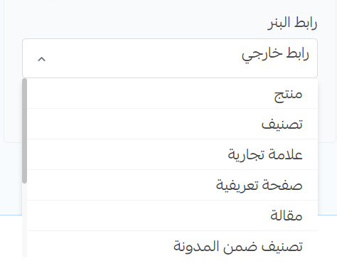
Banner Link
- Banner URL: Enter the URL where users will be directed when they click on the hero banner