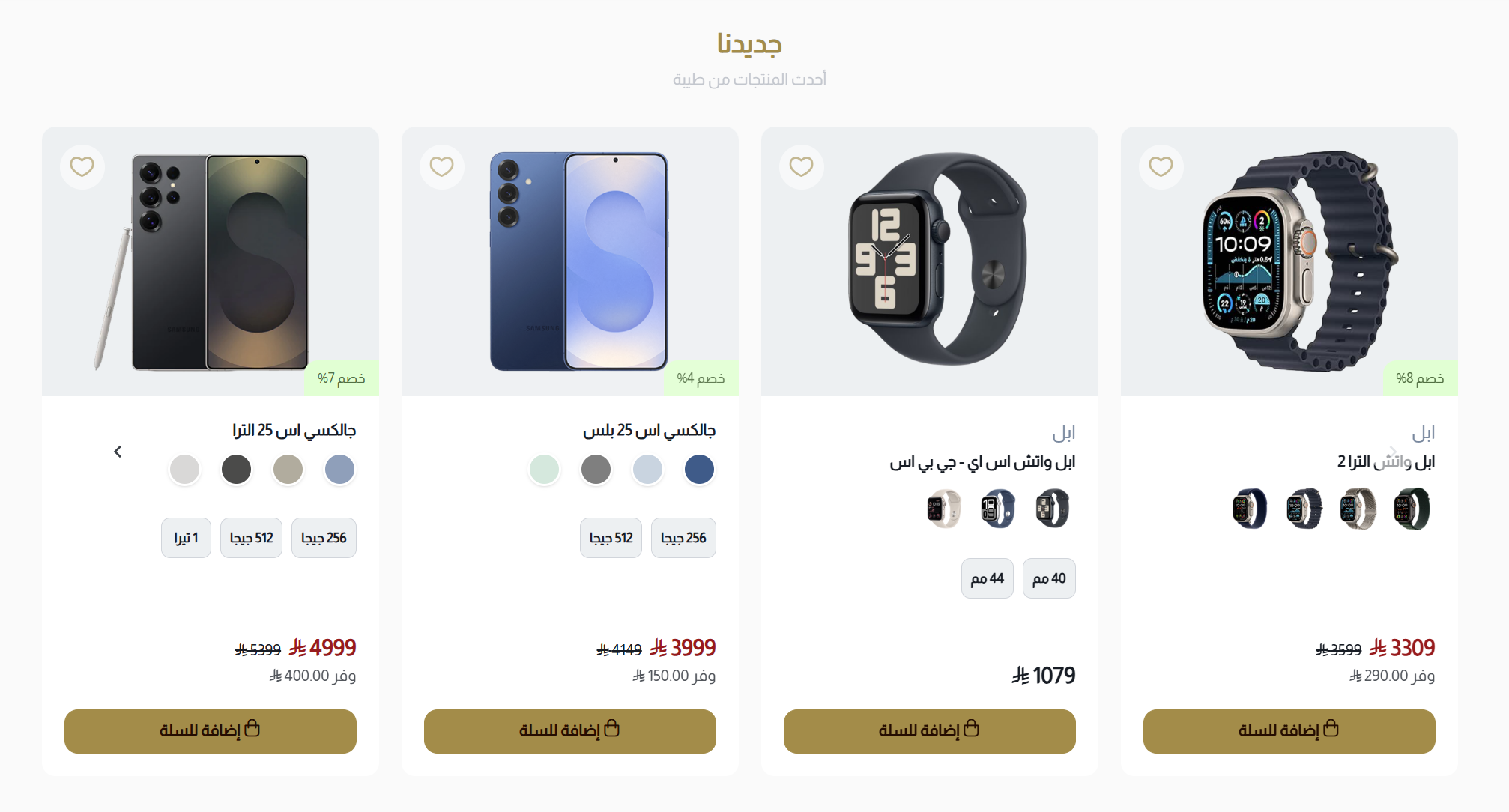
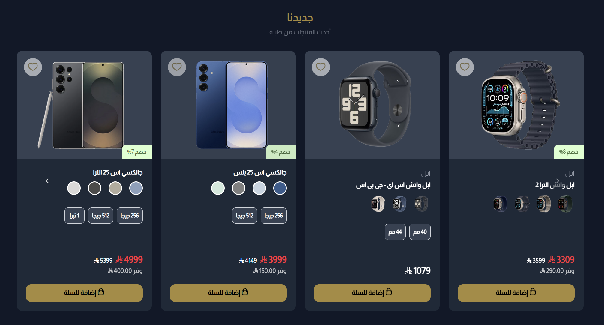
Product Slider
The Product Slider component presents products in an engaging, scrollable carousel format. Perfect for showcasing featured products, new arrivals, or special promotions while allowing customers to browse multiple items with minimal space usage.
Settings
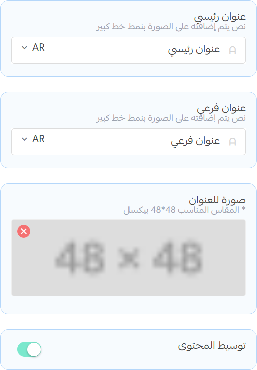
Title and Subtitle
- Title: Enter the main title for the section
- Subtitle: Enter a subtitle to provide additional context or information
- Image: Upload an image that will be displayed above the title and subtitle (recommended size: 48x48)
- Center Content: Toggle to center the title, subtitle, button and image within the section
Products
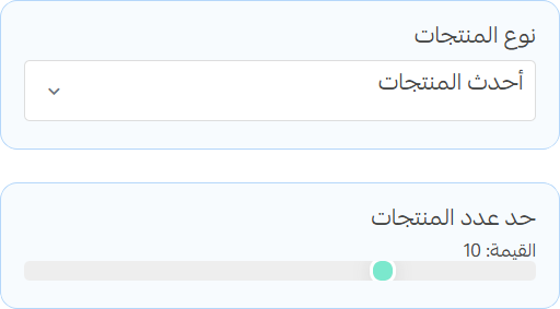
- Products: Select the products you want to display in the slider. You can choose from existing products.
- Product Limit: Set the maximum number of products to display in the slider.
Slider
- Enable Slider: Toggle to enable or disable the slider functionality.
- Autoplay: Toggle to enable or disable autoplay for the slider.

warning
When you disable the slider, the products will be displayed in a grid layout instead of a carousel.
- Columns in Desktop and Tablet: Set the number of columns for the product display on desktop and tablet devices.
- Columns in Mobile: Set the number of columns for the product display on mobile devices.

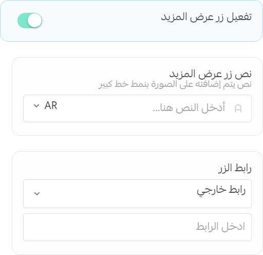
Show More Button
- Enable Show More Button: Toggle to display a "Show More" button at the bottom of the subtitle.
- Button Text: Enter the text for the "Show More" button.
- Button URL: Select the URL where users will be directed when they click on the "Show More" button.